And so concludes the retelling of the hellish experience I had watching Lost in Translation at the Varsity Theater.
Was it worth sacrificing a week’s worth of zippy one-liners and taking pot-shots at The Rock in The Rundown? Maybe. I got to flex a few different narrative muscles than before. I felt this was a story better told than read. I was curious to see if I could trump that notion.
If anything, it spurred from great debate. I received on e-mail suggesting that the inclusion of all the bomb mics was intentional – as if to enhance the surreal environment the two leads found themselves in while wandering around Tokyo.
It’s a fascinating thought, but one I reject. Lost in Translation is too quiet and intimate a movie to have the director constantly winking at us, saying, “See? See? It’s not told.”
Also, the cinematography by Lance Acord is too beautiful to wreck with poor composition.
The answer to my situation, I believe came from Abraham Brezo when he wrote:
“My guess about the boom mics is, that the film was shot open matte, and the projectionist forgot to matte the film. Leaving the film at an open matte will give it a smaller aspect ratio, thus including
everything that was supposed to be hidden behind the matte. This type of filmmaking is supposed to be more cost efficient.”
Judging by what I saw and comparing my experience against others who had gone to see the film, I’d say this was right on the head. It helps to aid my righteous indignation. Thanks, Abraham!
I’m doing a final flight-check for all things FallCon related at the moment. I’m leaving straight from my job this afternoon and I want to make sure I’m not forgetting anything. It’d be quite a shame to drive all that way to Minnesota to forget the posters I’m trying to sell.
…or my contact lens solution.
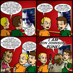
My puzzlement regarding the big-screen adaptation of Miami Vice is sincere. Why, of all people, Michael Mann would choose to direct it is beyond me.
I suppose there was a time when television properties were being remade for theaters. Typically light comedy fair like The Brady Bunch or The Beverly Hillbillies. You saw a swing into action with movies like S.W.A.T. and Serenity – which, admitedly, weren’t bad. Actually, they were both a marked improvement over the source material.
But to remake Miami Vice? Not only have they overshot the mark on translating television properties to movies, but it’s like a time capsule of fetid pop culture ugliness that no one wants to open. Miami Vice is a big, glaring becon of the 80’s only claim to fame – style over substance and egocentrism as a substitute for sexual appeal.
Who is demanding to see this movie? People who used to be cool in the ’80’s and want to revisit their glory days, that’s who. The people in between the marketing crosshairs of this movie are a very thing herd. I sincerely doubt it’s going to connect with modern audiences.
Do you want to TOTALLY superficial reasons not to see this movie? 1). Colin Ferrell’s mullet and porn moustache and 2). Jamie Foxx’s ever-inflating ego – which is now in direct competition with the Great Wall of China for the most easily recognizable man-made structure visible from space.
There. Are we happy now? Can we finally put a nail is 1980’s nostalgia? I think a "gritty" Michael Mann remake of Miami Vice means we have officially jumped the shark.
Abruptly changing gears, I want to draw your attention to a few other fabulous sites on the web to further distract you from your responsibilities and get you in trouble.
My good friend Joe Dunn got married over the weekend and is currently on his honeymoon. So, as a wedding present of sorts, I did a guest strip for him over at Joe Loves Crappy Movies. It went up on Monday and you can check it out here.
I wasn’t exactly prompt about sharing the link when the comic went up because I was embarassed about all the nice things Joe said about me. He cites me as an inspiration, but truthfully, it’s the other way around. I think Joe is a cartooning dynamo and I respect him immenesely. I can’t tell you how many of his comics I have read and said "Damn! I wish I had come up with that!" I’m thankful for talents like Joe to brush shoulders with. It makes me step up my game and makes me want to do better. It’ll be a hoot to hang out with him and the rest of the Digital Pimp Online crew next week at Wizard World Chicago.
Incidentally, you can find me at booth #3134 A at Artist’s Alley so please come and visit. I’ll have books and shirts for sale and I’ll be doing sketches for free. And when you’re done talking to me, you can talk to Joe. Because he has the booth right next to me.
Something else I should mention is my presentation of "Outstanding Comic" for the 2006 Web Comics Choice Awards. I think I mentioned it last week, but I believe there was some kind of problem uploading the ceremony to the servers. They accidentally announced all of the winners and I don’t know if everyone got to see all of the ceremoney comics that people worked on!
At any rate, you can find them here. Mine is kind of close to the top. It was fun to put together and I wanted you to check it out if you hadn’t seen it yet.
Aburptly chaning gears again, something I’ve been a little negligent on lately is telling you guys about all the great sponsors that are currently running ads with Theater Hopper. No, I’m not talking about those big banners on the top and on the side. I’m talking about the itty-bitty 88 x 33 banners directly above this-here blog.
First up is Brinkerhoff. It’s kind of complicated to describe, but it’s basically about a bunny that’s been divorced and what he does with his life after that. Doesn’t sound like a great place to mine comedy from, but creator Gabe Strine makes it happen.
Next is No Offense Taken. I’m struggling to find a description for you, but I like this comic a lot. Kind of random in a way. Maybe that’s why I can find a theme. But I think you should check it out. I’m certainly you’ll find something you like!
Silent Kimbly is a wonderful fantasy-like comic from the mind of Ryan Sias. The jokes are really more visual twists on common phrases, but that’s not the appeal of the comic. Really, it’s to check out Ryan’s beautiful illustrative style, whimsical designs and candy-rich colors. Check this out. It’s adorable and you’ll love it. I promise.
Grumps is a totally unique premise for a comic about a bunch of old farts in a retirement community. Web comics are often about to a youth market, so this is a brilliant play against expectations. The art looks like animation-level quality and the site design is really sharp, too. I’m trying to figure out if there is anything I can steal from creator Chris Jones’s layout.
Lethal Entertainment is an eBay store featuring the very best in horror, sci-fi and fantasy DVDs. If there is something unique that you’re looking for, odds are Leathal Entertainment has it and at a fair price!
Finally, I bring you Alien Loves Predator. Wedged somewhere between the brilliance of Twisted Toyfare Theater and Robot Chicken, creator Bernie Hou took the idea of posing action figures and made a brilliant web comic out of it.
And every day I’m incredibly jealous I didn’t think of it first.
Visit the site and catch up on the adventures of the two most unlikely roommates in all of New York City.
That does it for the sponosors currently running on the site. If you would like to see your site featured, pelase advertise with us. Currently is $10 for 30 days of coverage. That’s a pretty good deal and if you’re an up-and-commer, it’s a good way to get exposure for your site on the cheap!
Beyond that, I want to remind everyone that our sale on all t-shirts is still going on. You can still get yours for $9.99 until July 31. Some of you have already bought your shrits and are waiting for them. Good news, because I just mailed out a ton of them last week.
I also want to remind you about the Theater Hopper book – which I now have back from the printer and will be shipping out soon. I have about 100 pre-orders to take care of, so that’s going to keep me busy. But since it’s just me on the distribution end, I tend to do things in large bundles. So if you haven’t bought a copy yet, now is a good time because I toss your shipment in with the others! Order yours today!
Still here? I applaude your intestinal fortitude, but I have nothing left for you.
Thanks for stopping by!
You know, it’s funny. When I announced that I was ending Theater Hopper back in January (which feels like a lifetime ago), one of the things I highlighted was how I was finding it difficult to advance my art forward in a way that was not so time-consuming.
Well, I would say this final arc is certainly pushing my art forward, but it is no less time-consuming.
Things were so much easier when all I had to do was come up with a joke and draw a couple of characters facing each other to deliver it. Toss in the occasional visual gag to break things up a little bit and we had a formula for success!
With this last arc, I’m drawing fire, splatter, characters in different costumes – COMPLICATED costumes – and drawing 2 to 4 additional panels per comic. It’s madness!
Maybe there’s some truth about art and suffering. I’m punishing myself a little bit for ending the comic. Or maybe I just want to try to end things as best I can?
Either way, I appreciate everyone’s patience as we head into the last month. July’s pretty much it and then NO MORE THEATER HOPPER! Can you believe it? I can’t.
Actually, I’m not sure I can wrap this up in 4 or 5 more comics. I’d like to produce more, but the way I’m going, that doesn’t look feasible. Am I gonna have to break my August 6 deadline? I might…
I’m embarrassed that I might not hit deadline I set for myself almost 7 months ago. Maybe I should have planned better. But maybe I don’t want to say goodbye just yet, either?
Hell! It’s my comic! I’ll do what I want!
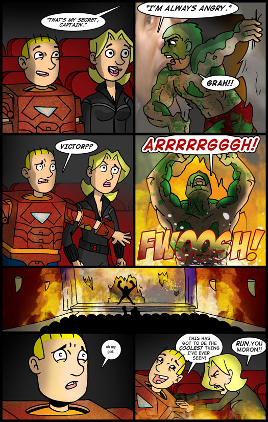
And I have! A theater engulfed in fire? Victor engulfed in rage? What does this mean for Tom, Cami and the rest! Stay tuned, true-believers! You’ll find out soon enough!


