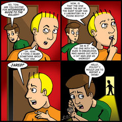
Well, it’s been three weeks, but I’m back. Didja miss me?
I have to say, I was a little worried that I may have lost touch with how to put the comic together after my long absence. After all, the last comic I drew was from April 8 – the Fever Pitch comic. But I’ve been drawing enough incentive sketches to accompany the guest artists we featured to stay loose and I think it all came together pretty well in the end.
Incidentally, the two other franchises Tom is confusing Hitchhiker’s Guide to the Galaxy with in panel two is Doctor Who and Red Dwarf, respectively. But, of course, any self-respecting nerd already knows that.
As fate would have it, this is kind of what the next arc will be about. Nerd-knowledge, or lack thereof. I plan on dovetailing out of the theatrical release of Hitchhikers Guide to the Galaxy and launching headlong into the release of Star Wars: Episode III – Revenge of the Sith. So buckle up, because the final chapter of George Lucas’s space opera doesn’t splash across screens until May 19.
In the meantime, if you would like a shadowy glimpse of who is on the other end of Jared’s phone conversation, Orneryboy
KIDNEMO – Comet 7
SAM LOGAN – Sam & Fuzzy
MITCH CLEM – Nothing Nice to Say and Coffee Achievers
JIM BURGESS – Able and Baker
JOSH MEINZER – Aikida
ZACH MILLER – Joe and Monkey
CHRIS CANTRELL – Please Rewind
JOERULES AND MADMUP – Digital Pimp Online and Madmup.com
CLAY YOUNT – Rob and Elliot
CARRINGTON VANSTON – Movie Punks and Eat My Words
Again, my heartfelt thanks to all of you.
Now, onto the site redesign!
I know at first glance it’s not drastically different. The think I realized when trying to come up with a new visual system for the site is, the one we had before really wasn’t that bad! So the changes you see to the “front” of the house are subtle tweaks. I think it cleans things up a little bit, spaces things out a little further and generally lets the site breathe a little more.
I’m aware that the blogs will now feel like they’re about three times as long since the news post area has been shrunk by about one third of the page width. But I’m talking myself into the idea that it’s easier to read a narrow column of text than a wide one.
Other parts of the site should be much more organized for you guys including the advertising area, the Walk of Fame and the store. I really tried to come up with something that would work across all sections of the site and separate out content in an easy to access way. I think the advertising area and the Walk of Fame benefit from this the most. In the old version, all of that information used to be on one page! Now it should be easier for you to hone in on the information you want.
Ultimately, the main drive for redesigning the site was to provide an opportunity for me to reorganize the back end. By that I mean, creating folders for all of the “departments” and building overall templates for the site. The previous version of the site had all of the web pages in one folder and all of the images in another. It made things VERY difficult to find! I’m hoping by separating content by category, I will be more inclined to make more updates to the site. Keeping things fresh and interesting for you guys and for myself! Less stressful moments when I try to find a page I want to edit!
Some parts of the site haven’t been hooked up yet. Most notably, the links and the bonus materials section. But since it wasn’t “mission critical,” it’s been put on hold for the moment. When they’ve been reintroduced in this design scheme, I’ll be sure to let you know.
And the easiest way for me to let you know when something has changed on the site is by signing up for our mailing list!
I’ve decided that I’ve gone far too long without a mailing list for the site and felt that adding one would provide an excellent opportunity to communicate with you guys about all sorts of site details that might get overlooked.
Shamefully, I committed myself to the idea during the story arc that introduced Charlie to everyone. Support was generally positive, but I received a few e-mails from people saying “I’m not really liking this story arc. I’ll come back to the site once it’s finished.”
That’s when I decided I needed a mailing list. So I could send a note out to everyone and say “The coast is clear! It’s okay to come back now!”
But the mailing list will be used for much more than scrambling to scoop up old readers after clumsy attempts to add new characters! I’ll also be using the feature to let you guys know about the convention appearances I will be making, cool conversations going on inside the THorum and when new merchandise goes up for sale on the site. Be the first to know!
As an added incentive for putting your e-mail on the mailing list, I am also working on a way to disseminate discounts to only mailing list subscribers! So it’s totally feasible in the future that I could send you all a message with a special code word you can enter when purchasing merchandise or advertising and get 10% off!
Anyway, that’s the long term goal.
Right now, the big thing I’m working on is getting the store back into ship shape condition. We have a couple of old shirts up for presale again. I’m working on setting up these designs for the baby dolls and hoodies, too. So hold tight!
You’ll also want to keep your eyes peeled for NEW designs on the site. Stuff that isn’t exactly related to Theater Hopper, but that I think there is an audience for none the less. If you sign up for the mailing list, I’ll be sure to let you know before I post any information about it in the news posts! See how that works.
There will be lots of little updates in the near future, so be sure to keep checking the site often.
If you have any thoughts about the redesign, feel free to send me an e-mail. I am entertaining all feedback!
Thanks again for your support! I’m really looking forward to the future of Theater Hopper as we head into the summer of 2005!
It might be worth it to mention that we have a couple of new advertisers this month.
First, if you’re in the market for a screaming custom gaming PC, then you should hook up with Maveric PC. These guys do a really good job and know exactly what you need to make sure you smoke the competition.
Our second advertiser is Me Stupid which is a great site full of reviews for movies, comics and video games. They’ve got some wonderful animations there to boot, so check it out!
We currently have two other ad openings on the site righ now that you can learn about on the advertising rates page.
One of the ads is a second column spot similar to the Me Stupid ad and the other one is a brand new ad located at the bottom of the page. It’s uniquely sized, but it’s big advantage is that it is on EVERY page of the site. That includes all of the new support pages I’m putting into development. The price is pretty cheap, so you may want to consider it.
And if you’re curious when our current advertisers will be giving up their spots, you can obtain that information on our advertising calendar page.
Thanks!
Related Posts ¬
| Mar 12, 2004 | ADVERTISERS, LINKS AND WHATNOT |
| May 16, 2005 | THE ADVERTISERS |
| Feb 18, 2005 | CELEBRATE THE ADVERTISERS |


